

A preview of coming attractions
A preview of coming attractions
Updates from behind the scenes

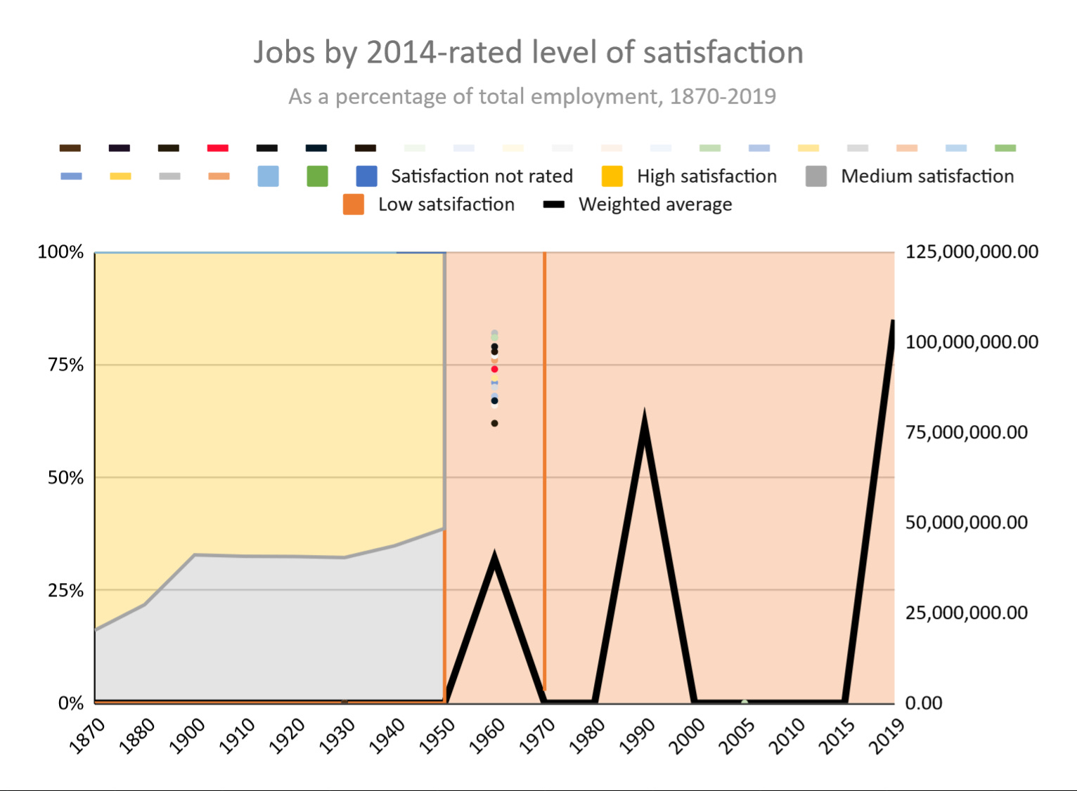
Hello world! I’m excited to share a few snippets from various dashboards in Google sheets that I’ve built exploring the history of the US labor market.
First, I was curious to get a more complete view of what the length of the workweek looks like at different types of jobs, and how each has changed (or not) over time.
As it turns out, most occupations tend to follow the same trends.

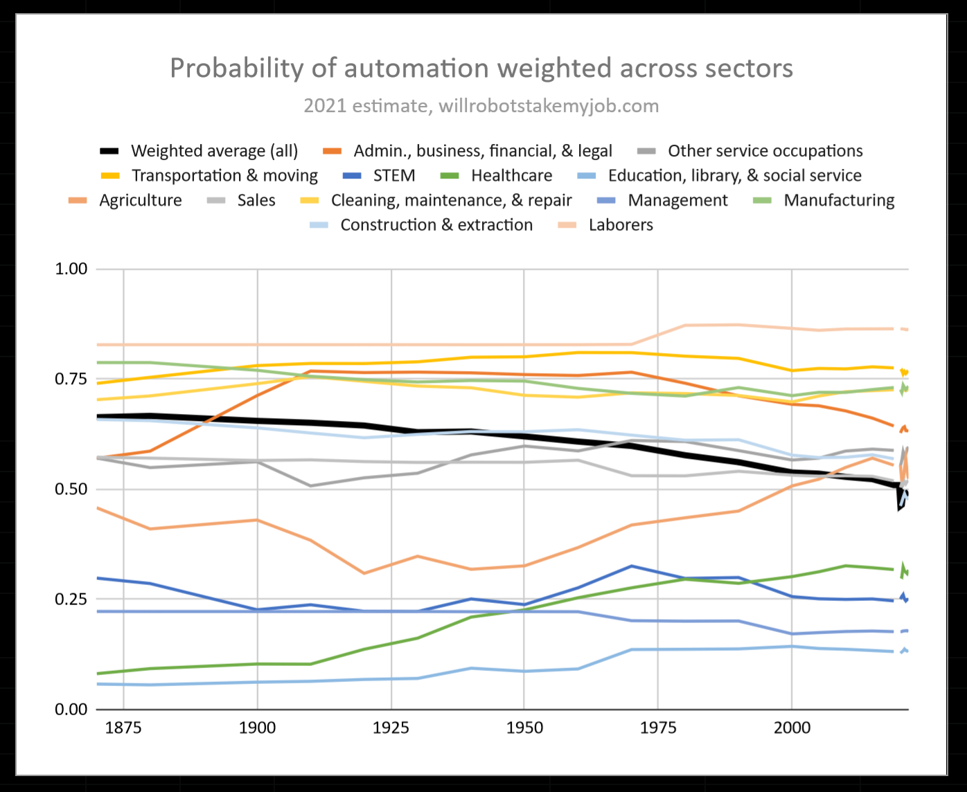
Next, offshoring and automation have had a strong influence on the types of jobs worked and labor’s bargaining power, particularly from 1970 onwards. willrobotstakemyjob.com has an index of the probablity of automation for almost every job category. If we were to come up with a weighted average of this index for all jobs and track it across time, we’d end up with something like this, with the average job currently having a 50% risk of automation, down from 60% in 1970 and falling roughly 2% per decade. This is uncannily consistent!
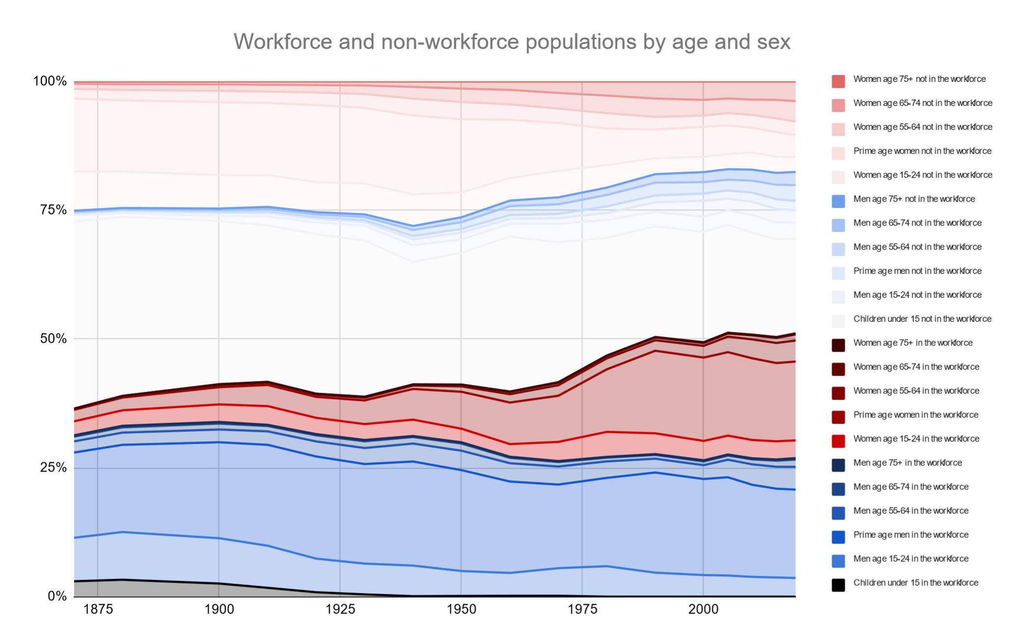
Finally, the rise in women’s participation in the workforce from 1960 to 1990 and how it impacted the labor market seems under-discussed relative to what a significant shift it was. I explore the implications of this a bit more in my piece about WTF happened in 1971?
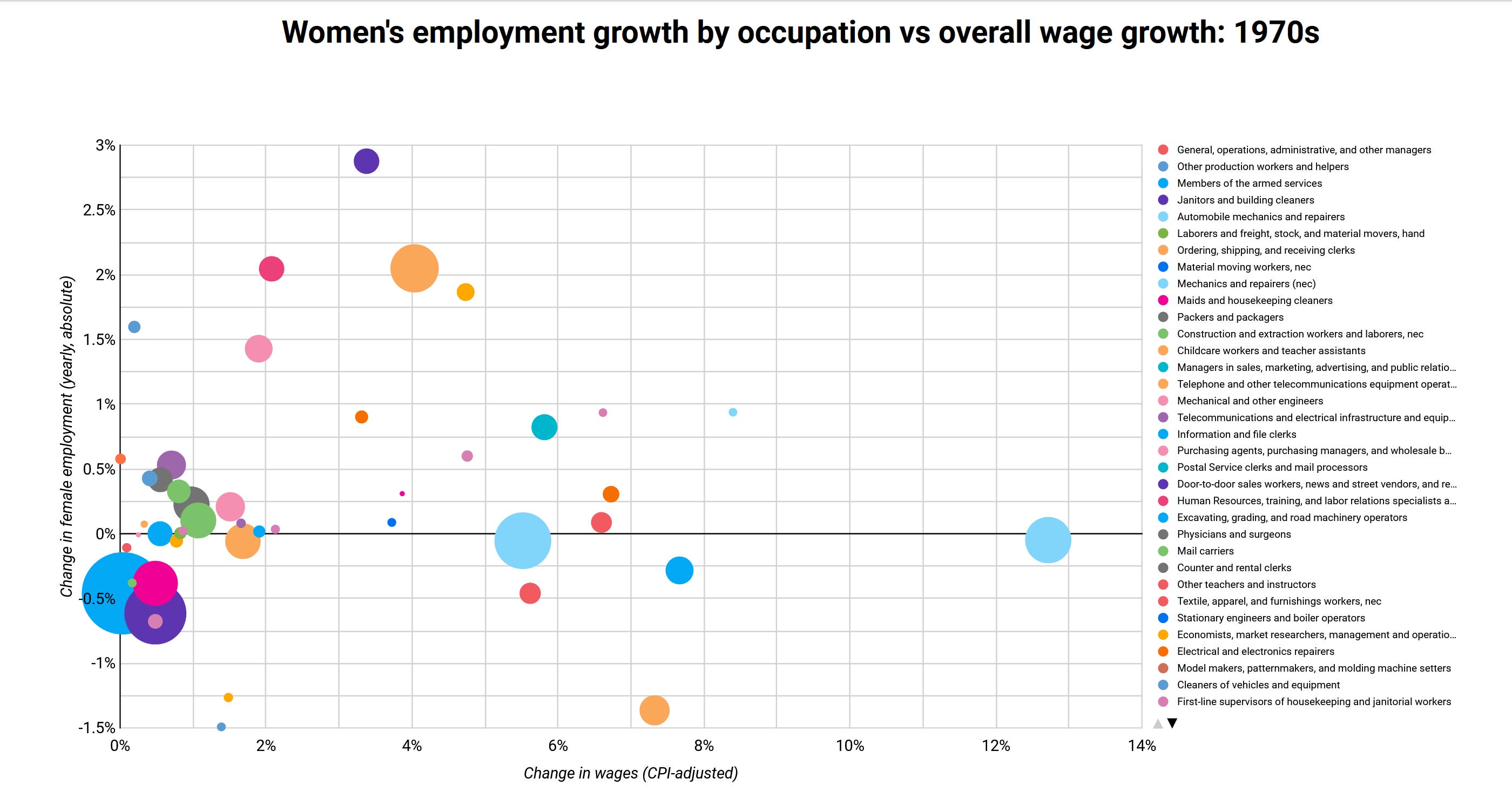
A new part of my engine (publicly visible here thanks to Google Data Studio) allows for comparisons of different types of growth rates and attributes of jobs. Here, we can somewhat of an inverse correlation between the change in the gender ratio of a particular occupation and the CPI-adjusted growth in wages in the 1970s.
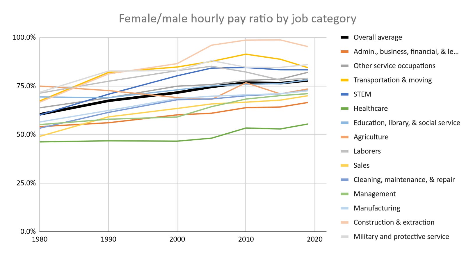
The gender pay gap really shows itself here— while it is steadily getting smaller (and we can see how if differs depending on the type of job), progress appears to be slow.
The issue with this data that kept me working a long time: in some years, there were significant shifts in how the Census defined various occupations. This is particular true in 1970, 1980, and 2000. I went through hundreds of these categories and either combined a several smaller inconsistent categories into larger, more consistent ones, or noted that the category was completely non-comparable between those years and excluded them from the analysis. However, I was able to arrive at a place where even in the decades which saw the most inconsistency, at least 85% of the data appears comparable enough using my hybrid classification system1 to draw valid conclusions.
As I build these tools for myself to quickly visualize economic data that’s just a bit too obscure for a source like FRED, the charts update in real-time. Sometimes they create gems like this. Abstract graph art?
The system I use for my analysis is a hybrid of the OCC 1950 and OCC 2010 occupational classification systems. I use OCC 1950 exclusively before 1970, and between 1970 and 2000 I begin to use the OCC 2010 systems, though with many smaller and emerging categories combined together. After 2000, most of my categories are exact matches with the OCC 2010 system, though some occupational classifications are still combined to allow for greater comparability with BLS OEWS and CPS data. Happy to share more details about this system with anyone who is curious about doing more robust longitudinal comparisons.